Reworking UW's Class Registration
Timeline • 3 weeks
Process • Triple Diamond
My Role • UX Designer
Teammates • 9 UX Designers & 1 Project Manager
Tools • Figma, Zeplin & Zoom
Growing into a Professional
I graduated at the start of COVID, when teachers were scrambling to convert in-class content into their online counterpart. My department’s capstone project didn’t survive the ordeal and the class lost the opportunity to add a great piece to their portfolios. After graduation, I was left with uncertainty and many thoughts swirled my head:
• "How can I get a job with no experience?"
• "How could I help my family during this time of need when I haven't gotten my foot in the door?
• "Will I be able to make it as a designer"
I combated this overthinking by listening to my peers around me by focusing on networking with design mentors, listening to professionals from adjacent disciplines and engaged in design communities. I was lucky enough to find an opportunity to grow with a design mentor working at Expedia. With this apprenticeship under my belt, I focused on setting professional goals for myself.
1. Learn how I fit as a teammate and how I work with others.
2. Practicing using Figma and Zeplin.
3. Understand how UX fits in a Sprint.
4. Learn how to conduct UX Research.
Week 1
The Challenge
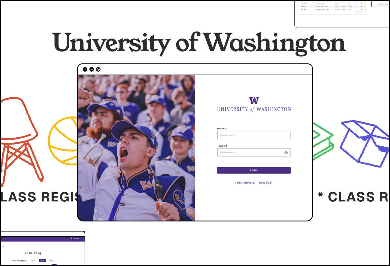
Necessary information were scattered throughout different platforms. Most importantly, students had to find the SNL number of their classes on another page to type into the registration system to find specific class.
I worked with a team of 8 other UX designers to improve the class registration process for the University of Washington. As a fun task, those of us who did not go to the university, were assigned to figure out how to register for a class. When all of us failed to do it without external help, we knew in-coming freshmen and international students were bound to be confused. We conducted 5 user interviews with university students to review how the current process works. There were a few things the team noticed:
I worked with a team of 8 other UX designers to improve the class registration process for the University of Washington. As a fun task, those of us who did not go to the university, were assigned to figure out how to register for a class. When all of us failed to do it without external help, we knew in-coming freshmen and international students were bound to be confused. We conducted 5 user interviews with university students to review how the current process works. There were a few things the team noticed:
Scattered Information
Necessary information were scattered throughout different platforms. Most importantly, students had to find the SNL number of their classes on another page to type into the registration system to find specific class.
Unclear Call to Action
The steps to achieve registration were not intuitive. What made this harder was the lack of clarity on how to complete the steps and where to get the information to complete it.
Unfamiliar Terms
Students were unfamiliar with some terminology, making it harder for students to navigate certain steps and if items were of importance for registering.
Complicated Navigation
Returning students struggled with figuring out where to navigate throughout the process. There were several different ways students could register.
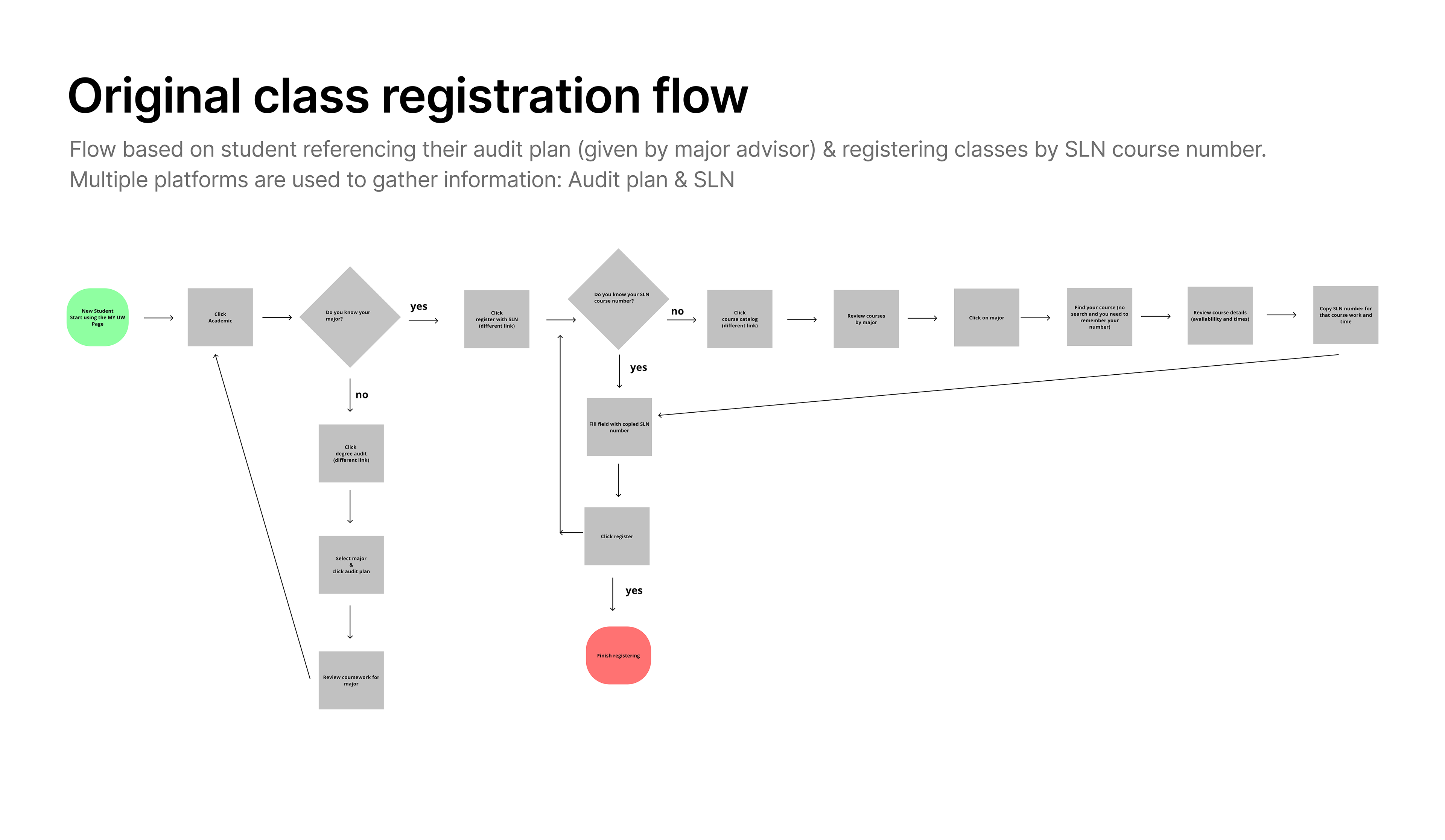
Initial Registration Flow
We mapped out the original registration flow and looked towards other university registration processes. We took inspiration from James Madison University and California Institute of the Arts (universities a few of us went to) and interviewed several users currently using these systems.
Key insights we took away were:
Key insights we took away were:
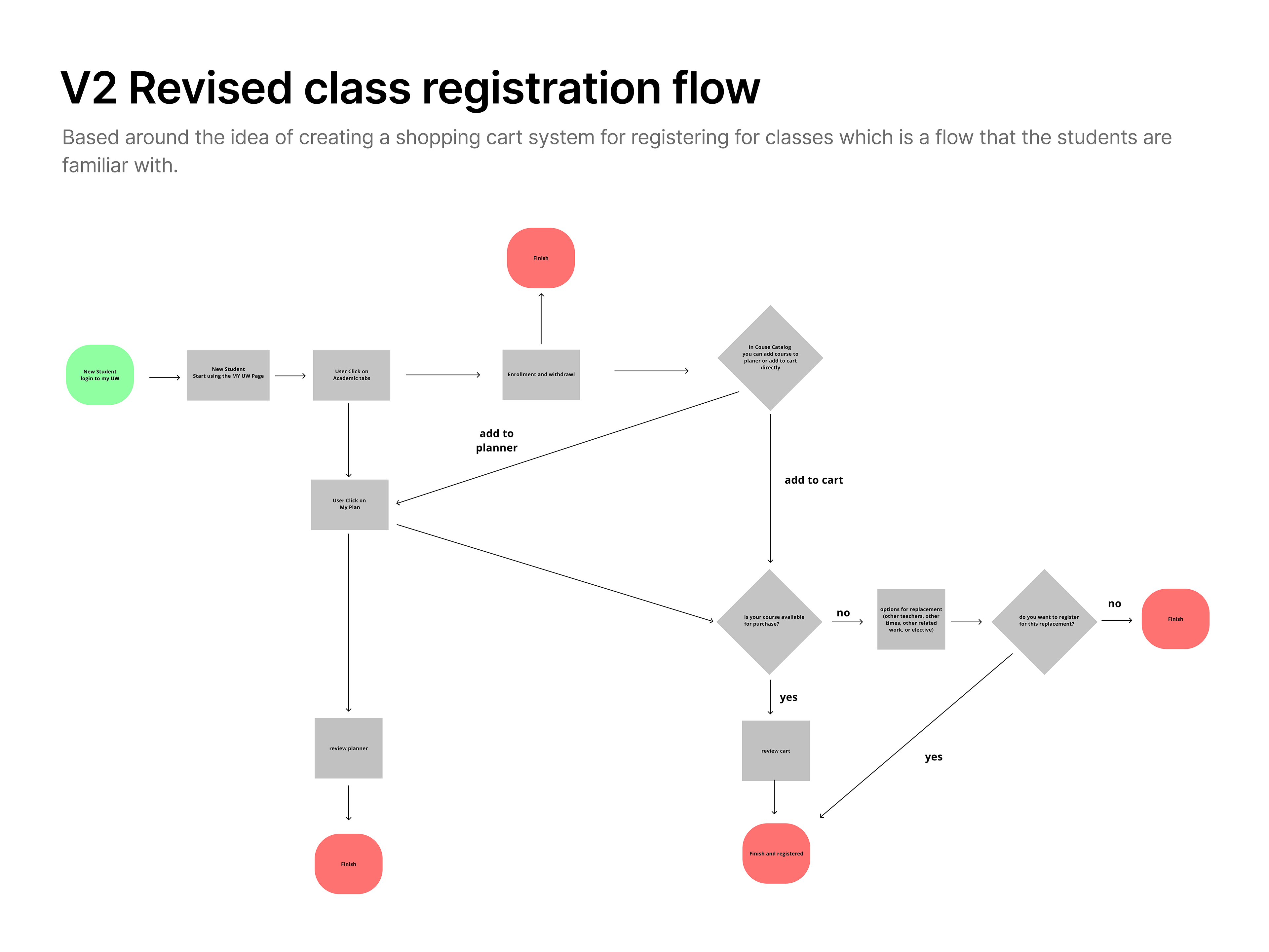
• Both JMU & CalArts registration process mimicked systems users have used before like the idea of a shopping cart system
• Users had access to an online planner which gave them quick access to plan, track & refer to their major, minor & general studies requirements
Determining Constraints & Target Audience
Although the majority of the team loved the idea of incorporating a student planner, we had to narrow down our scope to prioritize the necessary actions to register a class. With the limited amount of time & having back to back communication with the product owners & developers, we hypothesized that users had some knowledge on what classes to take and their major/minor/general education requirements & prerequisites.
Here is what we decided to focus on & our target audience:
• Target audience were new university students between the ages 18 - 21.
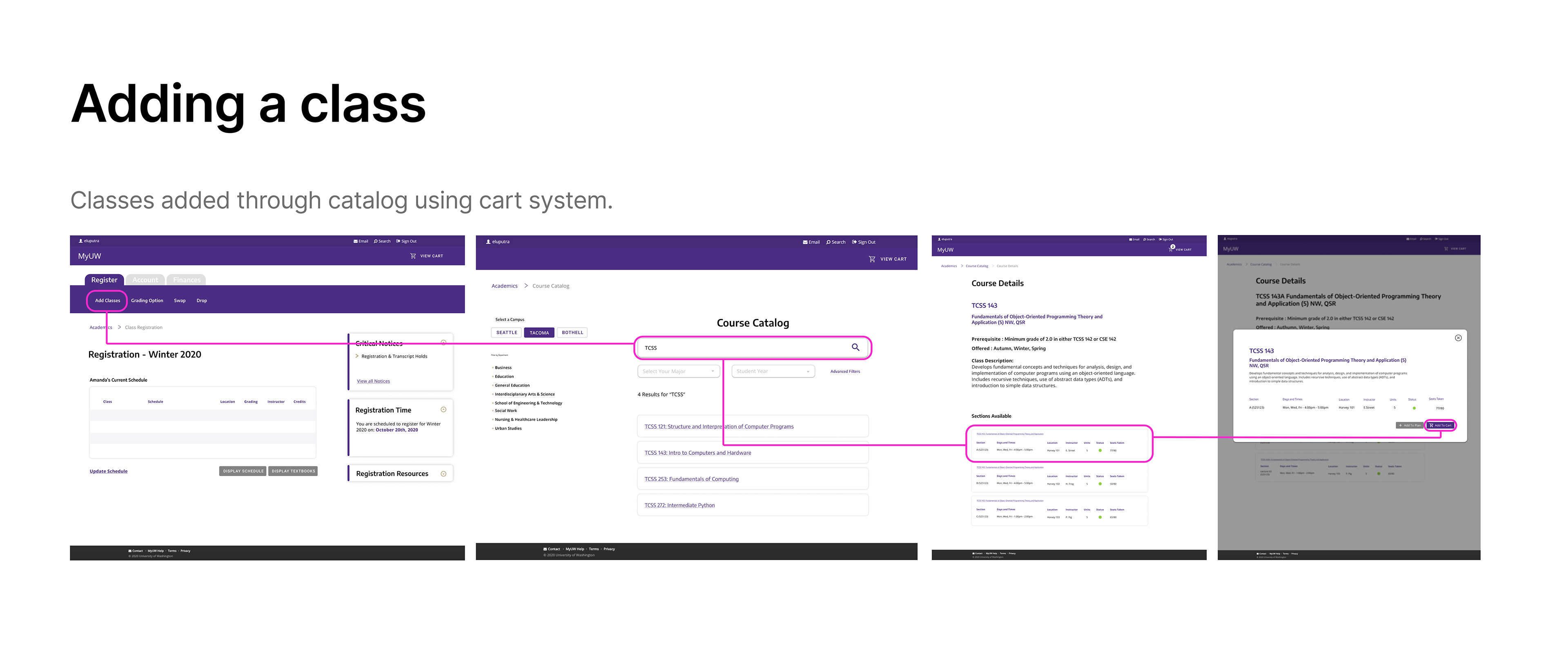
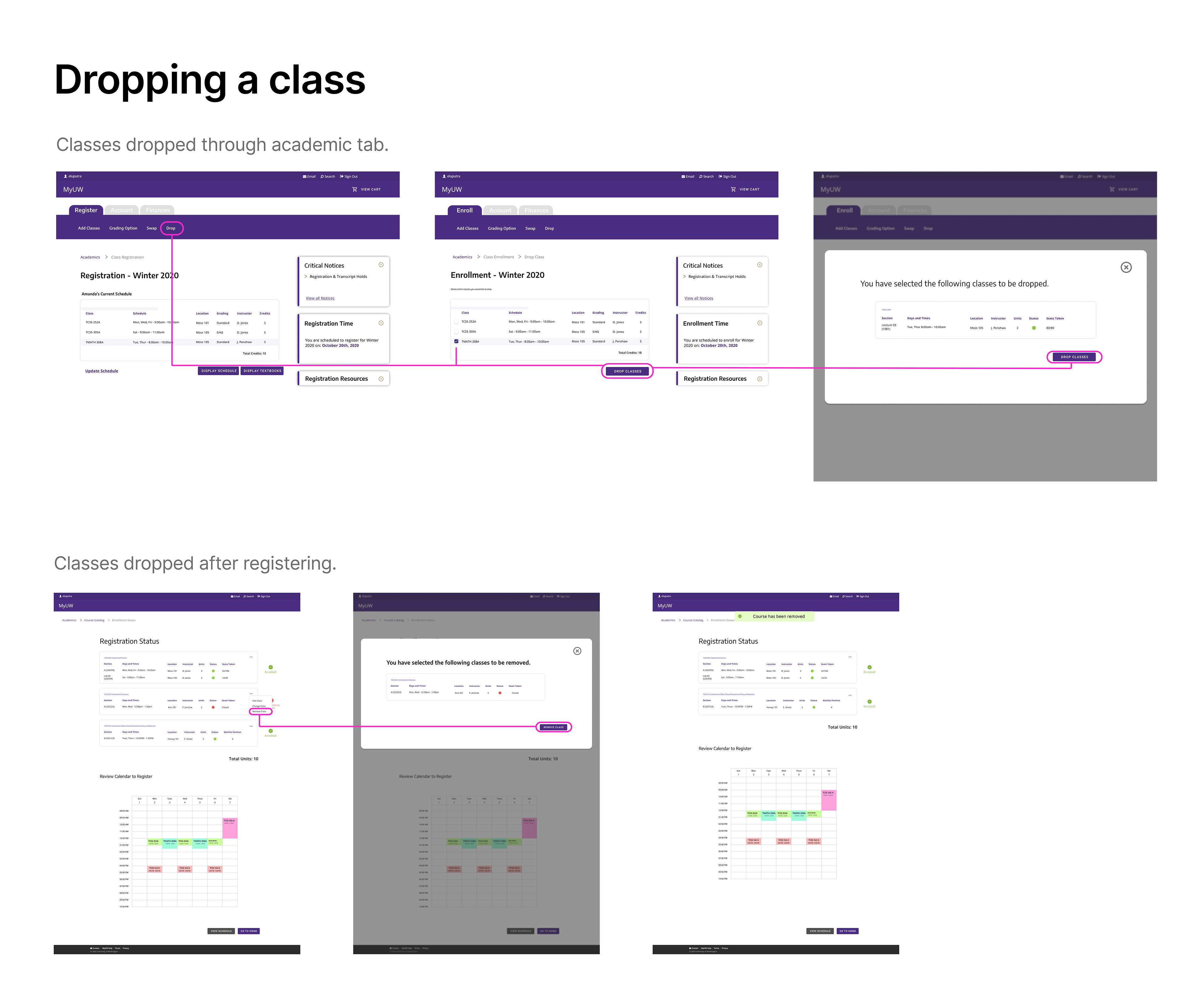
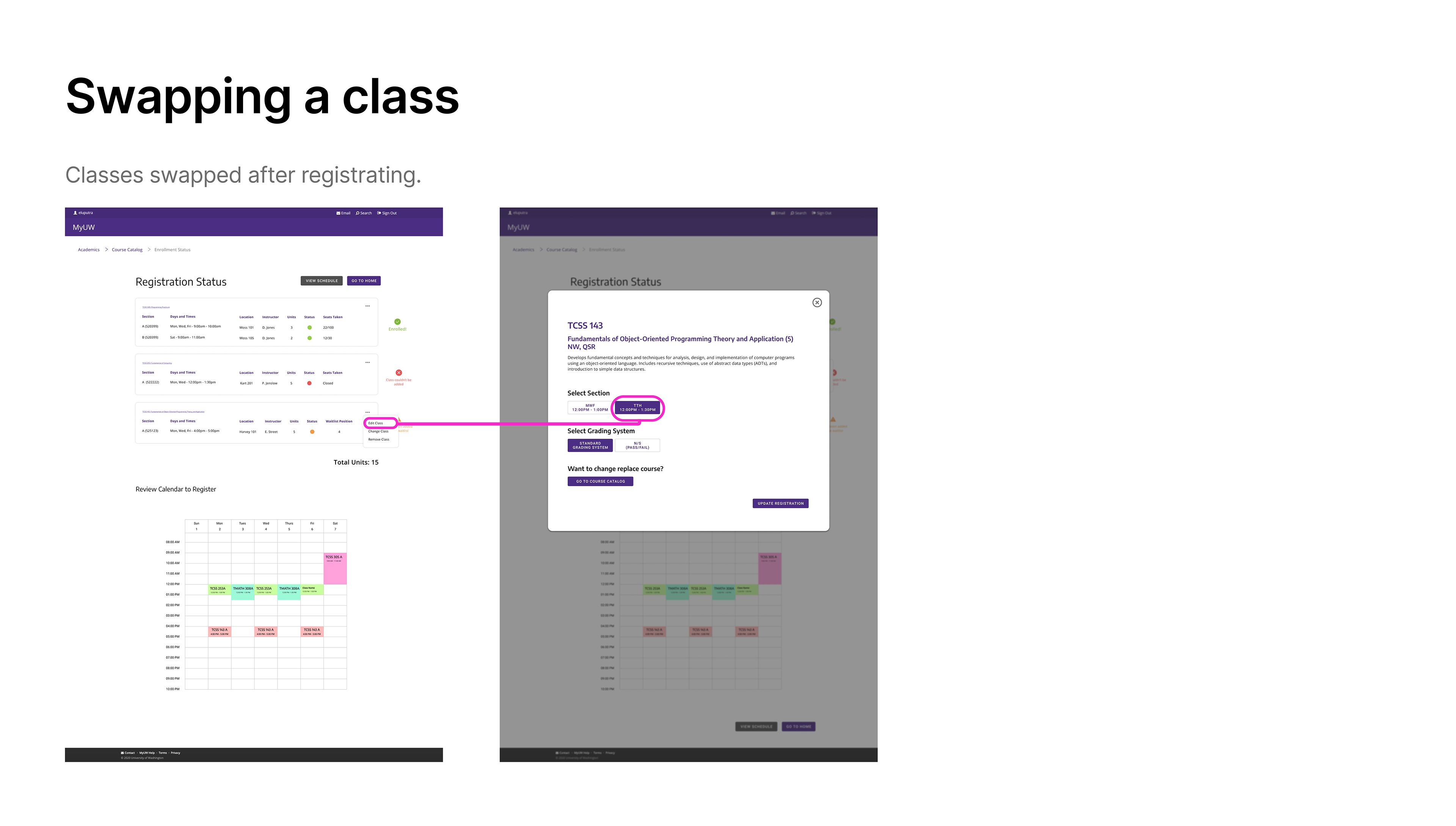
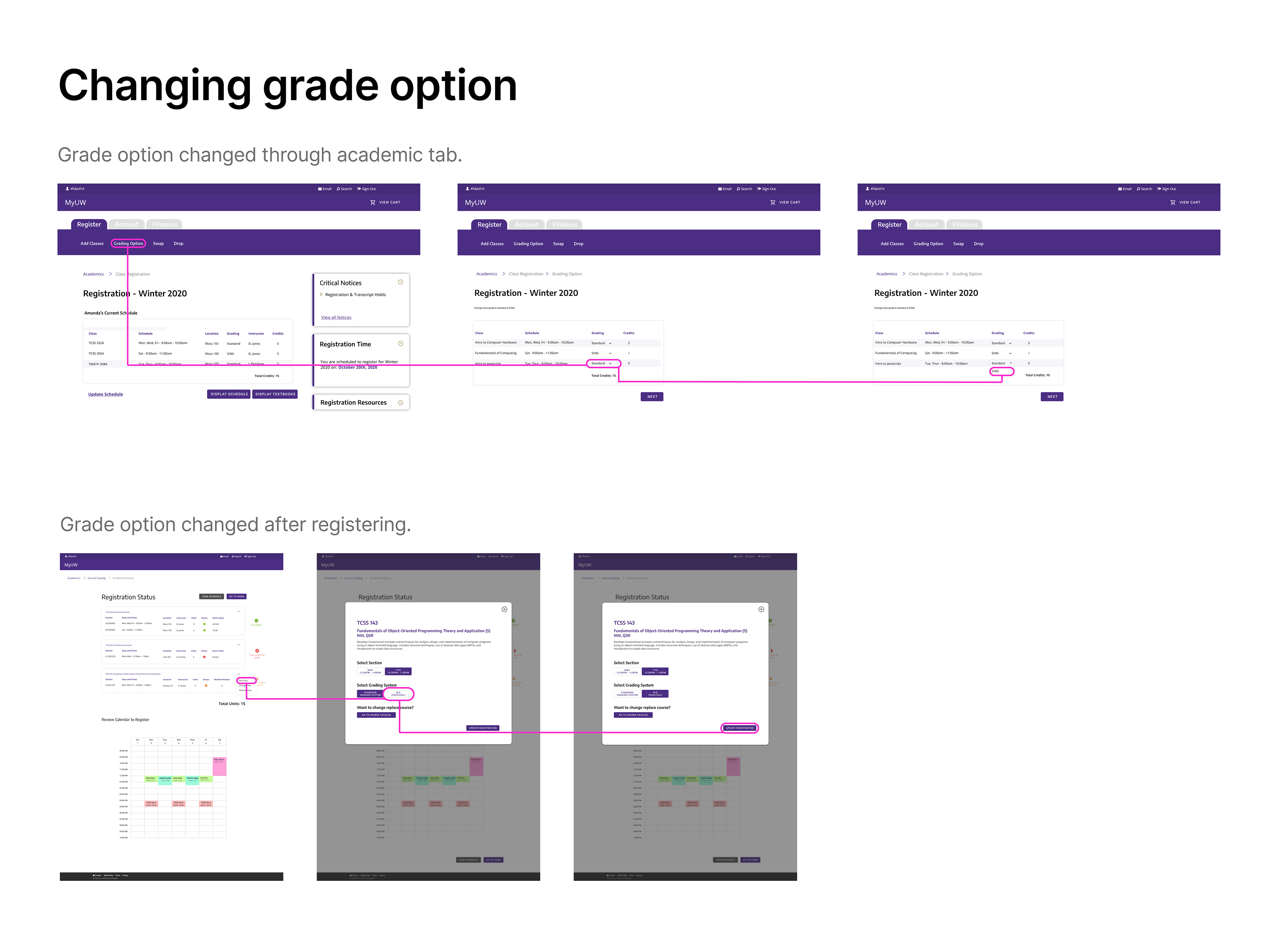
• Focused on adding, dropping, swapping classes & changing grading options (pass/fail or letter grade).
• Target audience were new university students between the ages 18 - 21.
• Focused on adding, dropping, swapping classes & changing grading options (pass/fail or letter grade).
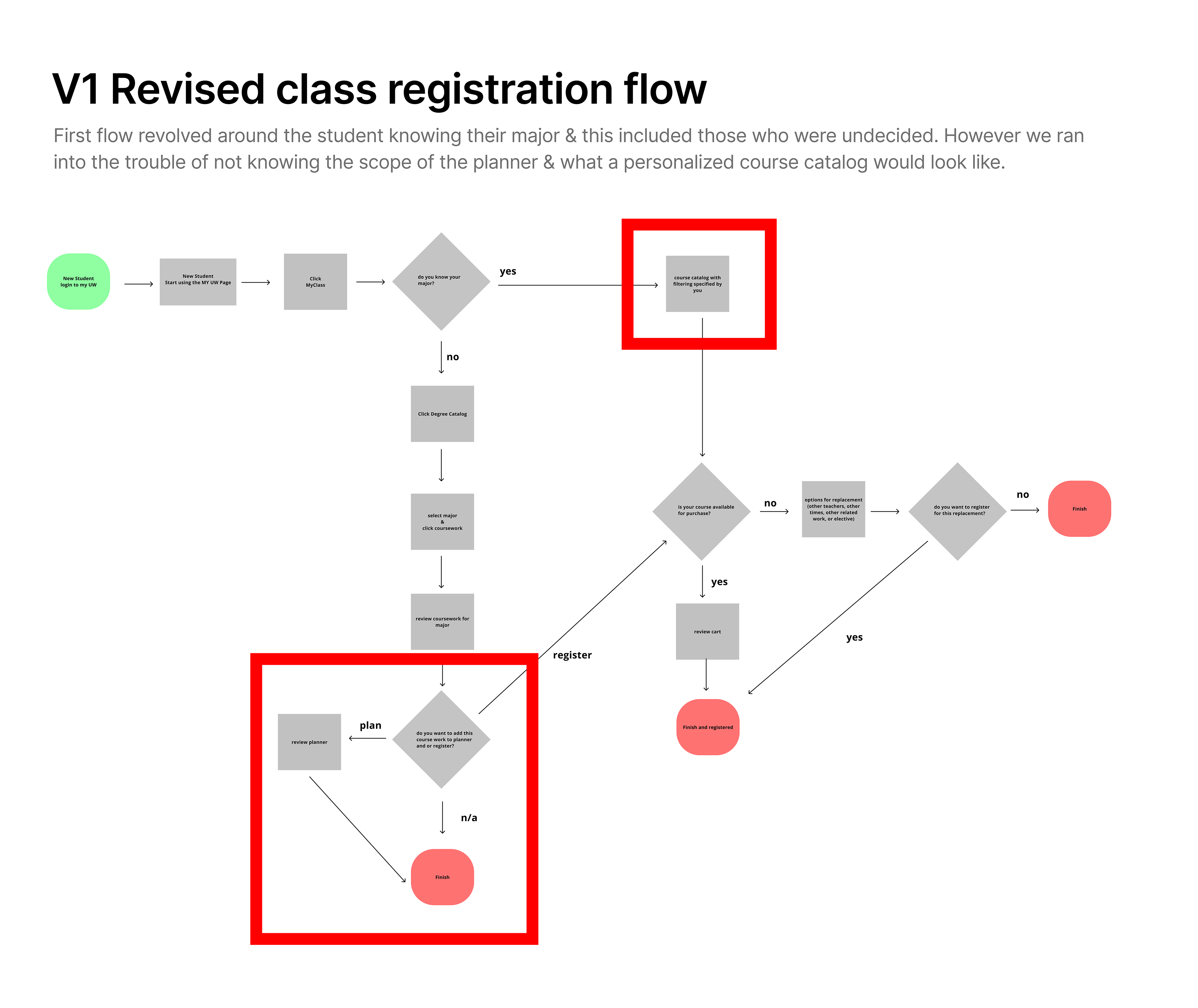
Revising Registration Flow
To gather UI examples, I looked at other universities to see how they may have solved similar issues University of Washington was having. From the interviews prior, we learned that users from other universities thought their registration system was similar to other systems they have used. This gave me the idea to look outside of our university examples like Amazon & Etsy.
We created a bird’s eye view as to what areas were having problems and where we could optimize. By visiting problem areas of the flow, we could see where certain ideas could work and what wouldn't make the cut.
Week 2
The Design Process
The aim for this sprint was to create an intuitive registration process for the students, increase the speed of class approvals, submissions & swaps and to improve retention in the college registration process. In order to achieve those goals, we simplified the number of steps & language used. Using the updated user flow as reference, we created concepts on its appearance ending with the high fidelity results below.
Week 3
Results & Updates
We conducted our first usability testing on our first iteration with 6 users and an average 67% success rate per task. There were a few design elements that confused users:
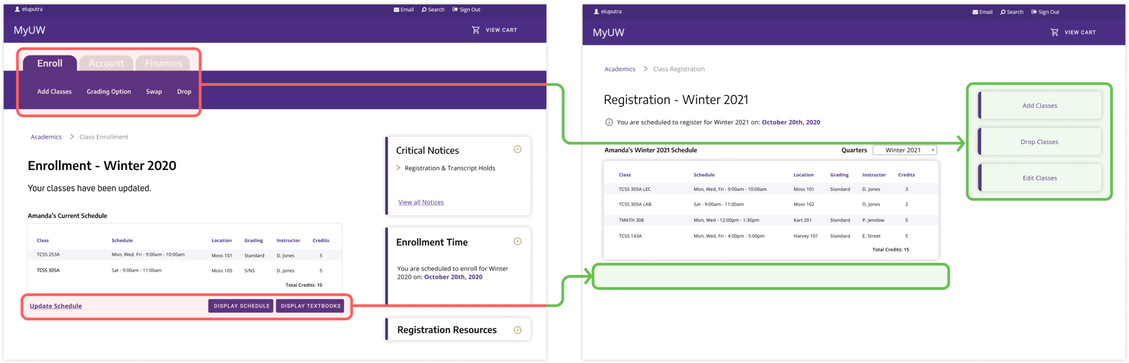
Tab header was not distinct enough and was being completely overlooked by users: We removed the tab header altogether and redesigned it into clear and simplified CTA buttons on the right side. This led to problems with the users completing their tasks.
“Update Schedule” link with its color and underline was highly distracting for users: We simply removed the “Update Schedule” button completely along with the “Display Schedule” and “Display Textbooks” buttons since these features were not necessary and over complicating the users task.
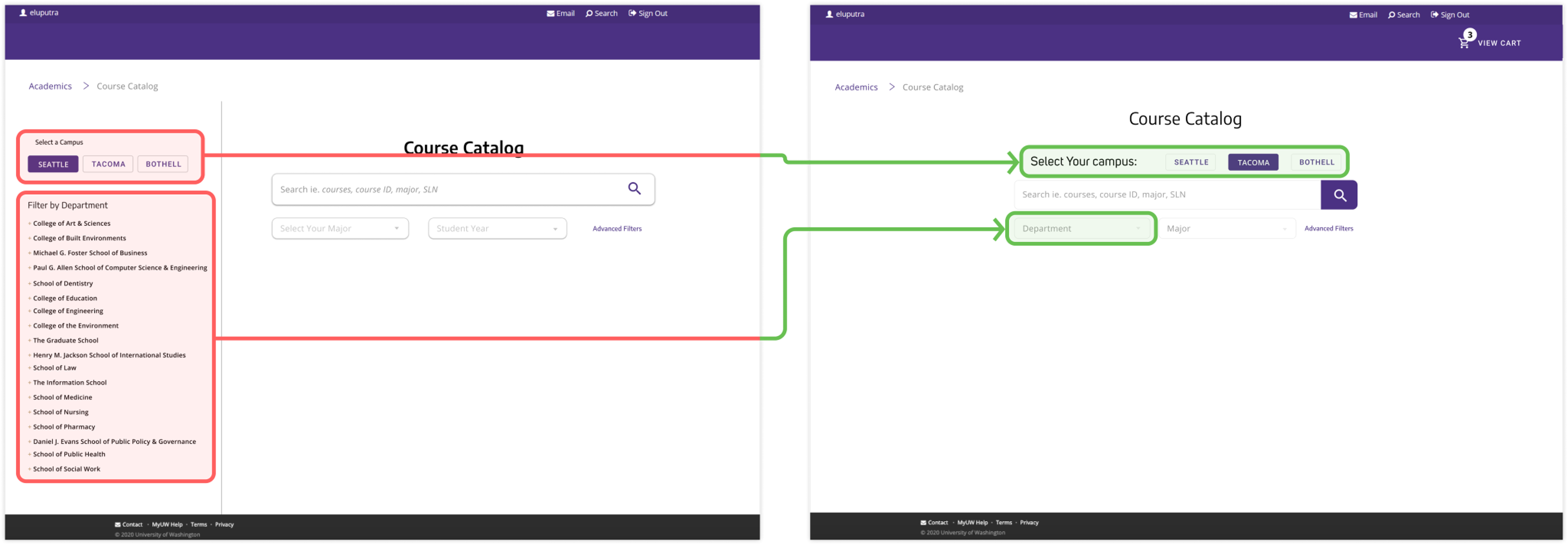
“Selecting the Campus” was obscure causing users to skip over the requirement before searching: To draw more attention to the “Select the Campus” function it was placed above the search function and required to be inputted before continuing on to searching for a class.
Users were not paying much attention to the department filter because they were focused on searching for a class and distracted from this function: The left hand department menu was removed and consolidated with the filtering functions in the center section to providing more clarity in the design through white space.
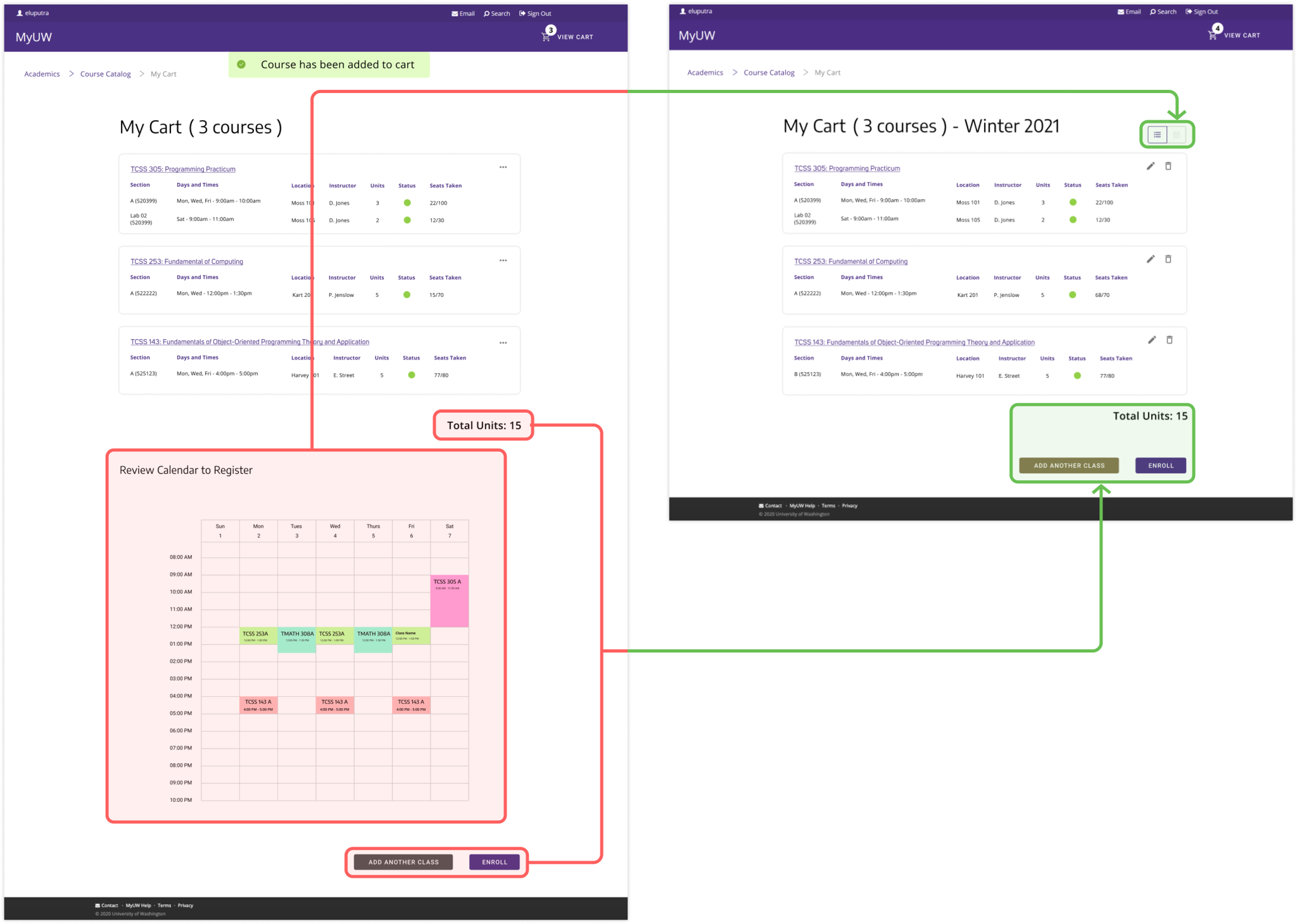
Users were having a hard time finding the “Enroll” button: Rather than scrolling down past the calendar to find the “Enroll” button, both the List View and Calendar View were consolidated into a toggle button allowing the “Enroll” button to be moved up into the screen view.
Ellipses icon was not intuitive for most users to click and edit classes through: This caused confusion and frustration for users trying to edit their classes. The ellipses icon was changed to two separate more intuitive icons for users to edit and remove classes.
Final Iteration
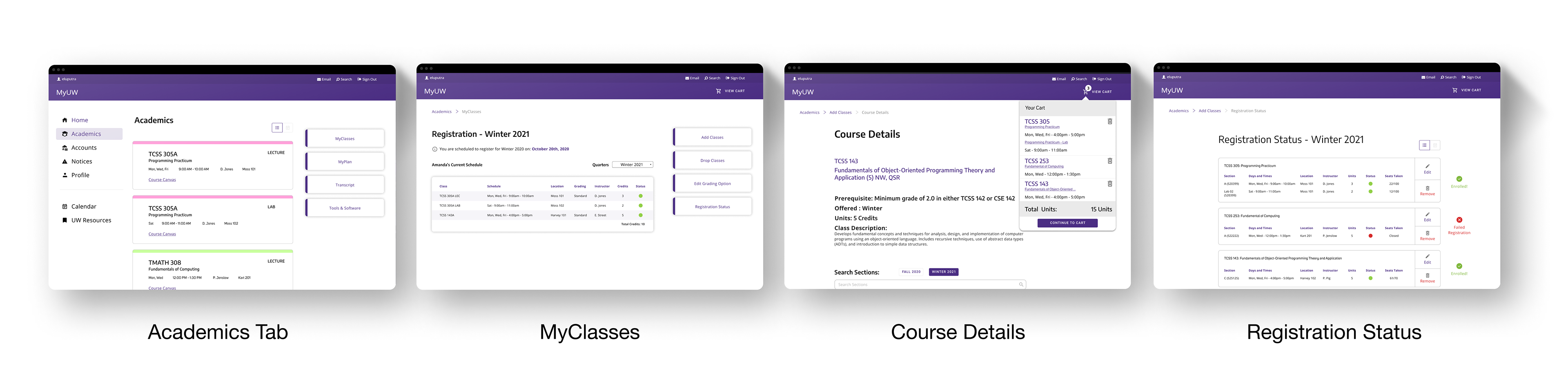
Final Results
In this testing, we brought in users representing different age groups: (18 - 21) and (40 - 55). Our primary audience catered to students from the first age bracket but we wanted to test if older students had differing results. Thankfully, all students in both age brackets could use the new UW registration system without any or extensive help.
"This system is easier than what my university uses. I don't have to look up those darn SLN codes for my classes anymore."
5/5 users were able to register their classes successfully.
4/5 users admitted they preferred this system.
Reflection
I came into this sprint doubting the skills I've developed in college. Imposter syndrome played a huge role in challenging myself for better or worse. And I acknowledge I carried this feeling since my years at university. I pushed myself to take action and failed often so I can quickly better understand how UX works in the industry. The personal goals I set for myself in the beginning were skills I was able to develop thanks to the mentorship.