My Journey from Junior Designer to Team Lead
Timeline • 2 months
Process • Double Diamond
My Role • UX Design Co-Lead
Teammates • 9 UX Designers & 1 Project Manager
Tools • Figma, Zeplin & Zoom
Path to Professional Growth
During my time as a design teaching assistant at GMU & JMU, I loved collaborating with students in finding creative solutions and when I started my UX Design journey, I knew I wanted to do the same and support others in pursuit of their goals.
Setting Goals
I wasn't completely certain on how I was going to co-lead this project, but I was determined to become the leader I envisioned myself to be. I would be a cheerleader in my teammates' professional growth. There were three goals I gave myself:
1. Create a safe space for teammates' to vocalize their thoughts.
1. Create a safe space for teammates' to vocalize their thoughts.
2. Be someone who is available, listens & can give time to find solutions together.
3. Learn about my teammates' interests & create opportunities for their growth
Weeks 1 & 2
Gathering User Research
VRV is a streaming media service specifically focused on anime shows, hosting several anime channels like Crunchyroll, Cartoon Hangover and Hi-Dive. Not all of my teammates were familiar with VRV, so I took this as a good opportunity for the team to get to know the website.
I asked them to observe the main flows of the website and to note design solutions on different tasks (like how to purchase a channel bundle or different ways to navigate to a show etc). More importantly, I wanted each member to note what they were frustrated with or enjoyed about the site. Though, designers aren't users, this exercise meant to evoke empathy & bring awareness to the site's user experience.
In order to understand competitor platforms, we conducted 16 user interviews to observe browsing behavior & gathered over 50 survey results noting the users' age, watching habits & other competitor sites. I started with these two methods to:
• Help ease team members into conducting user interviews & note-taking
• Better understand user behavior with the current product
• Quickly gather baseline data on who users were & direct competitors
Researching the Competition
The best part of being a mentor is seeing the students' cogs turning and responding to their curiosity! Because my teammates felt they had good understanding of the user experience in VRV, they were automatically curious about other similar websites.
I introduced them to the concept of competitive analysis and with the research we gathered, I divided the team into groups of 3 to review both our direct & indirect competitor sites. Teammates categorized users' pros, cons & behavioral patterns so we got an aerial view on what to observe at the competitors' sites.
I introduced them to the concept of competitive analysis and with the research we gathered, I divided the team into groups of 3 to review both our direct & indirect competitor sites. Teammates categorized users' pros, cons & behavioral patterns so we got an aerial view on what to observe at the competitors' sites.
To simulate company presentations, I gave them the opportunity for each group to present on their findings. By meeting client needs and reporting crucial information early, design teams are able to win buy-ins for additional resources and research, a point I stressed to them.

Addressing the Project's Scope
The team used the Red Routes Method to ranked each pain point by its priority based on the information gathered from the user interviews.
Main themes we discovered about the pain points were:
• Little visual distinction between watched & non-watched episodes
• No option to go directly to next episode from previous episode
• Generic categories on home page
• Little information about channel bundles benefits
• No alert for new episodes for liked shows
• No option to go directly to next episode from previous episode
• Generic categories on home page
• Little information about channel bundles benefits
• No alert for new episodes for liked shows
Given the limited timeframe, we narrowed down our scope to focus on 3 user flows which addressed the top pain points:
Flow 1: Search for TV Shows
Flow 2: Resume a TV Show from the Watchlist
Flow 3: Buy a Channel Premium Membership
Weeks 3 & 4
A New Design System
A main focus of the project was for the team to learn how to create and manage a new design system in Figma. Figma was relatively new at this time but luckily many of my teammates had tinkered with similar software.
First, I determined where my teammates' proficiency was with Figma by giving them a task to create a small component. I created hands-on workshops based on what teammates struggled with. I specifically tackled:
First, I determined where my teammates' proficiency was with Figma by giving them a task to create a small component. I created hands-on workshops based on what teammates struggled with. I specifically tackled:
• Determining the difference between Grouping & Auto Layout
• Understanding Auto Layout use cases & Constraint Fundamentals
• Creating components & atomic design
In order for the junior designers to feel confident in their abilities, I paired them with senior designers to work together on components until the juniors felt confident in their abilities. Seniors then would review their work, leaving notes in Figma for improvements. I found out from the team on how helpful pairing a junior & senior was, with one senior designer noting,
"Younger designers don't share the same jargon experienced designers have. It's good to get used to each other's language even if it's something small like creating a component."
"Younger designers don't share the same jargon experienced designers have. It's good to get used to each other's language even if it's something small like creating a component."
Here's a snapshot of the components I created and helped finalized!
Weeks 5 and 6
Design Iteration & Prototyping
On our first pass of the researched-informed design, we first started with removing any jargon, redundant design elements and added clear labeling.
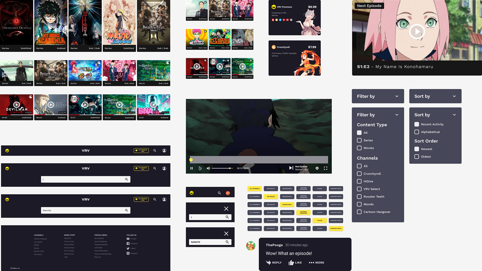
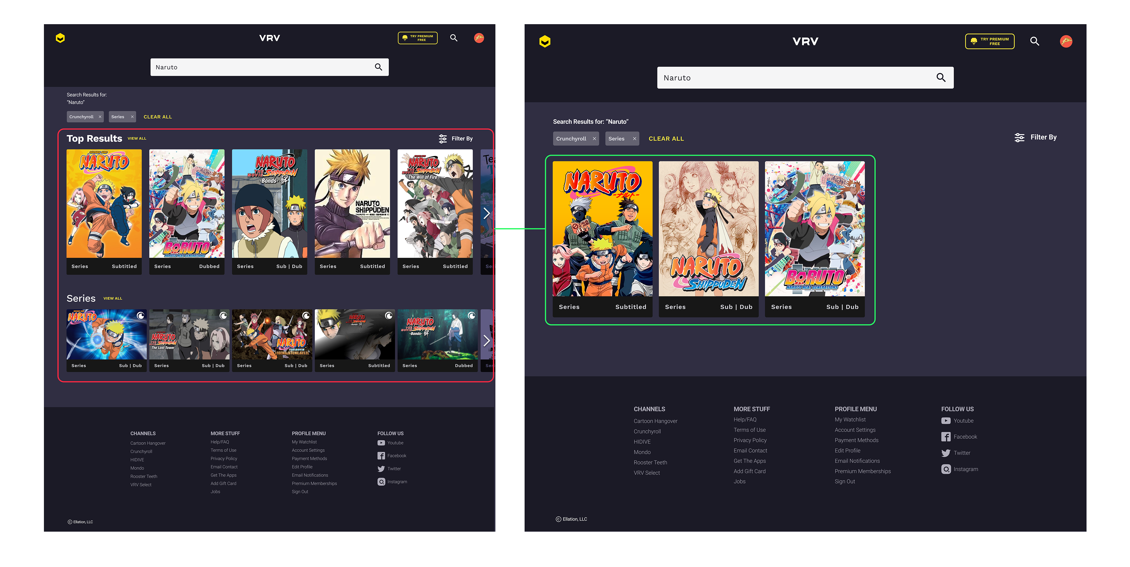
Searching for a TV Show
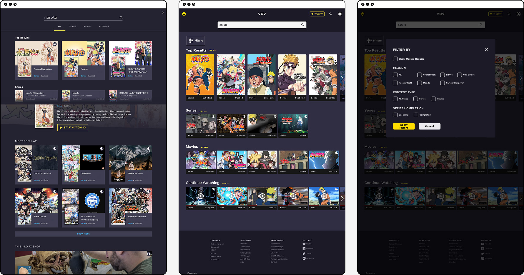
During the initial user interviews, we noticed users spent more than 5 seconds to find a specific show when viewing the search results. (Search results included shows, movies & similar shows) We removed categories like "Most Popular" & "This Old FX Shop" since this confused users when they scrolled down. Relevant categories were made more prevalent.
Some teammates wanted to test if a Filter button would be a useful feature. I suggested they should try to create some ideas on how it would work and allowed them lead the functionality conversation as well as the user tasks for the upcoming user interviews.
Some teammates wanted to test if a Filter button would be a useful feature. I suggested they should try to create some ideas on how it would work and allowed them lead the functionality conversation as well as the user tasks for the upcoming user interviews.
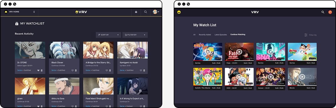
Resuming a TV Show from Watchlist
We asked users who used other sites, to speak out loud on how they go about resuming a TV show. Many mentioned it was as simple as going to their watchlist and finding the show.
One of the downsides with VRV's watchlist is it only provides an image of the show and users are not able to click on the image to go to the summary page let alone continue where they left off. Users would be forced to search for the show instead of it being a click of a button. For improvements, we made it so users are able to resume a show from the "Continue Watching" tab.
Another pain point pointed by the users is to see whether a show they follow has any new episodes. We created a "Latest Episodes" tab so users are able to see which shows have new episodes that week.
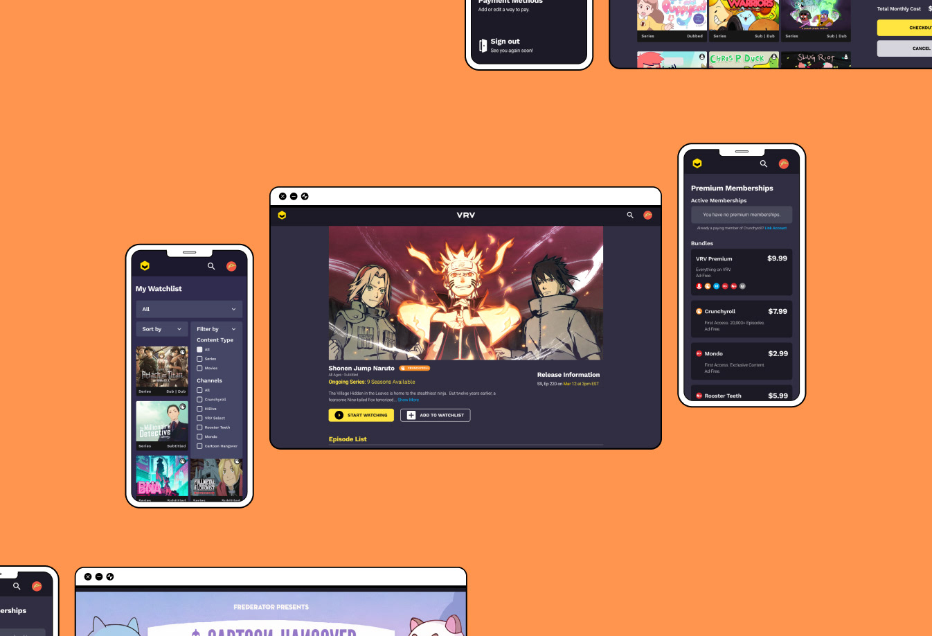
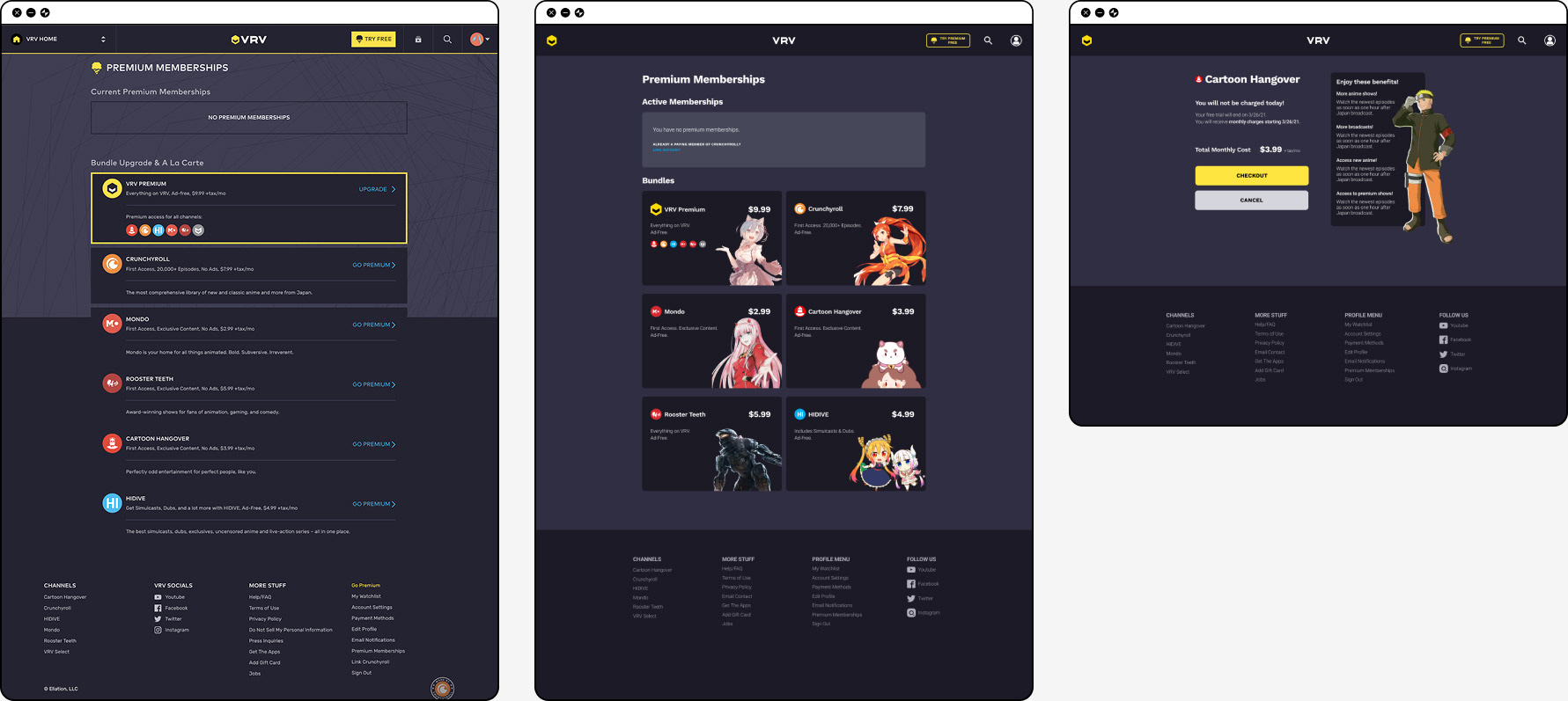
Buying a Channel Premium Membership
Users struggled with where to find information on Channel Bundles and understanding which shows were from which channels.
Rather than channels seemingly "sneak up" on the unknowing users by showing a popup to subscribe, we tried to integrate the channels where they are more visual by moving the channel selection on the home page. More information about the channel bundles was added on the Premium Membership Page.
Rather than channels seemingly "sneak up" on the unknowing users by showing a popup to subscribe, we tried to integrate the channels where they are more visual by moving the channel selection on the home page. More information about the channel bundles was added on the Premium Membership Page.
Results from Prototype
From the first couple user interviews, we learned that users still struggled with finding the show "Naruto" amidst all the Naruto series & movies from our prototype but didn't with standalone shows that only provided 1-2 results.
But we learned more about the limitations of our prototype & the importance of refining user tasks.
But we learned more about the limitations of our prototype & the importance of refining user tasks.
• Most users expected "Naruto" to be under the "Top Picks" category on the home page due to it being a popular anime.
• Most users did not know they received a free month trial when purchasing a channel bundle & ignored reading the benefits card.
• Some users felt restricted by the prototype since their process of resuming or continue watching a TV show was different from what the prototype offered.
• Most users did not know they received a free month trial when purchasing a channel bundle & ignored reading the benefits card.
• Some users felt restricted by the prototype since their process of resuming or continue watching a TV show was different from what the prototype offered.
Weeks 7 & 8
Making Final Improvements
Realistic search results: To improve upon the last iteration, redundant & inaccurate search results were removed. Certain users, from the last testing, were familiar with Naruto & were confused when some search results were in categories that did not make sense. No comments were made about the issue during this testing.
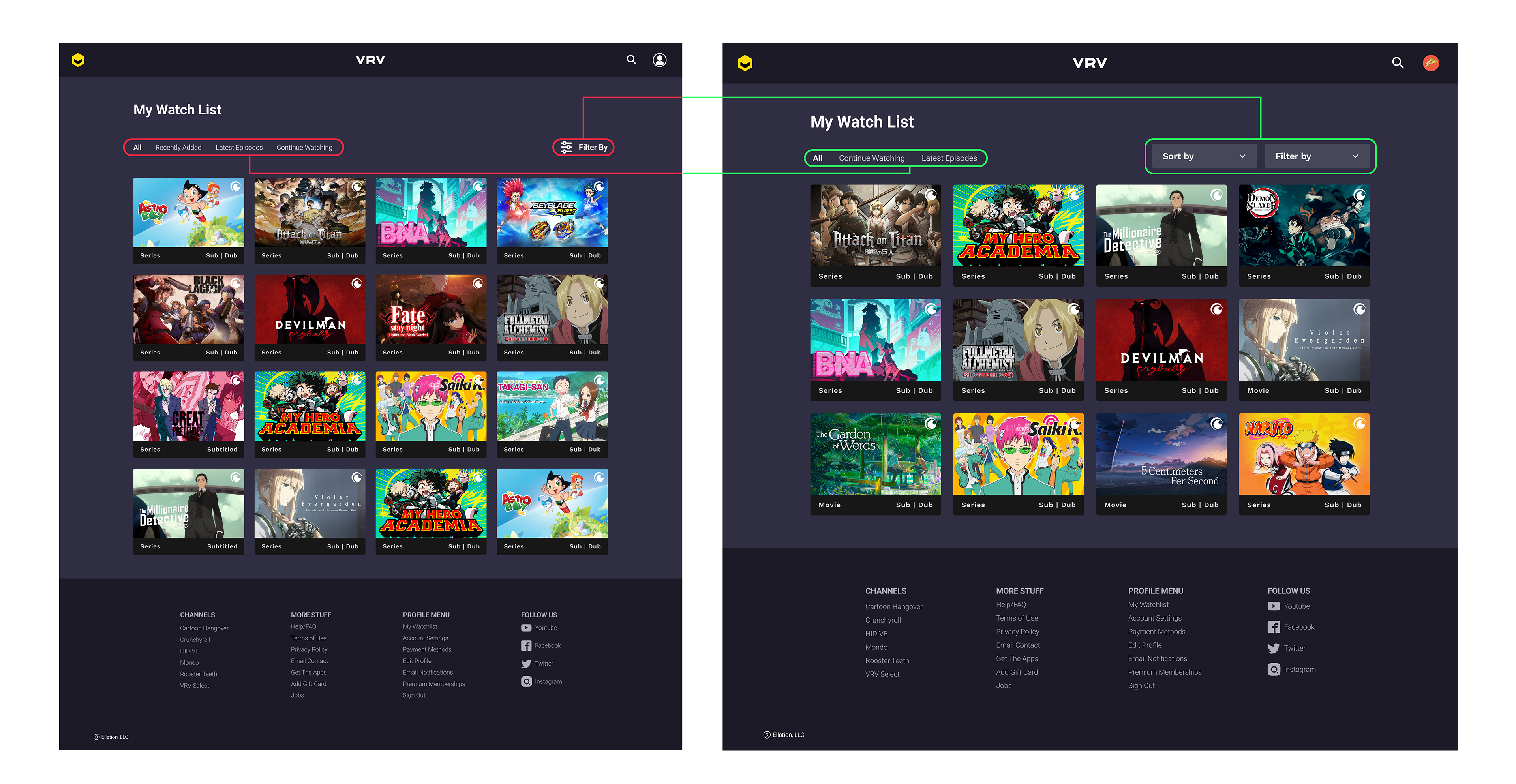
Reworked watchlist: Users, during the last testing, performed the worst on the watchlist task. This time, users had an easier time resuming the test show & successfully displayed numbers of ways to get to it. Older users preferred using the Continue Watching category on the home page while younger users felt more comfortable using the profile menu.
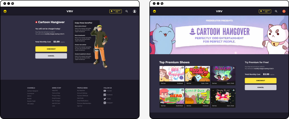
Channel benefits makeover: Users wanted a clearer way of understanding what benefits they were going to receive & a reminder that they had a free month membership bundled with the purchase. The new benefits page was more welcoming and users reacted positively to seeing the shows included. The majority of users were pleasantly surprised when they received a free month subscription at the end when the popup appeared but most importantly they understood they received it without moderators reiterating.
Final Design
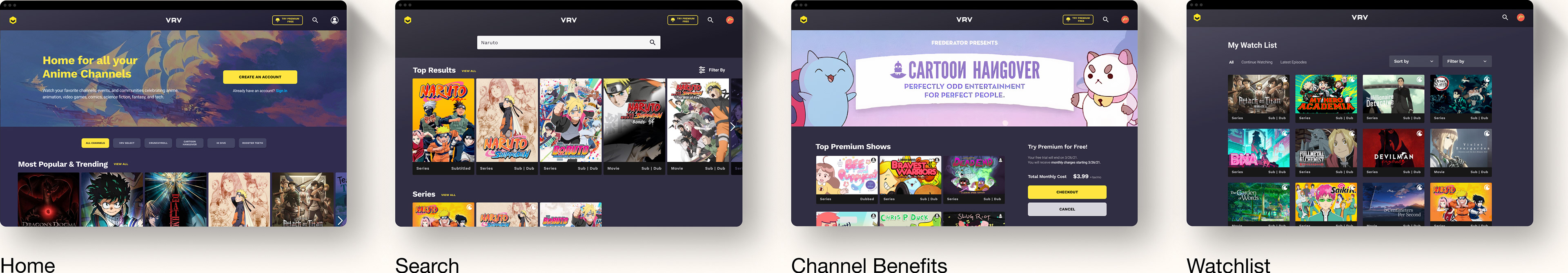
Searching for an anime
Resuming a show through watchlist
Paying for premium membership
Reflecting
UX design doesn't come without its bumps on the road and this project was no exception. As a co-lead, figuring out when to finalize decisions during team decision conflicts was unfamiliar to me at first. This was pressured by the limited time & efforts we had to complete the project.
One philosophy I knew I stood by was that the team had to be held by one common goal in what we were trying to make, reinforced by our research. This idea was more eloquently put by UX Planet,
"All members of the product design team should have a shared understanding of the idea & the major decisions in the execution process. The team members should understand the rationale for each decision and how it moves the project forward in all."
This idea became the criteria for how and when we would come to a consensus to the team's decision making. When a team member did not back down from their differing opinion, I made sure to pull them aside and listen to their response. I did this for two reasons:
1. I wanted to be a leader who was understanding and acknowledged their team members.
2. The more frustrated someone is, the more important it becomes to listen to them.
2. The more frustrated someone is, the more important it becomes to listen to them.
I often learned that conflict sprung up ideas, which brought up concerns we discussed in up-coming meetings, made our decisions more thought through. I found these growing pains to be great catalysts for experimentation and encouraged teammates to expand on their ideas.
A Kind Remark
I was impressed with Kat’s ability to get people on board with ideas and keeping everyone on the same page. And her ability to understand her team's strongest and weakest points. She was very aware of where someone needs help and was always up spending more hours helping them out. And of course, her fun nature and big smile made the whole working experience memorable and delightful.
- Senior UX Designer